
Oil paint is a key instrument in a painter’s artwork journey. Mixing of color and understanding complementary elements on a canvas’ color scheme can create further realism and balance to a cohesive palette.
As a painter, an essential step in using your core five paint shades (blue, brown, white, red and yellow) is understanding what colors will be an outcome from certain combinations. Out of all the main colors, blue can have the largest effect (in my opinion) on how the vibrancy of a color will come out.
The two main blue oil paints
The two blue shades that will aid your mixing journey are: one with a green undertone, and one with a red undertone.
The colors to look for are French ultramarine blue (red under-toned) and cerulean or pthalo blue (green under-toned, deriving from cyan) in your color palette. You can also find just ultramarine with a green undertone.
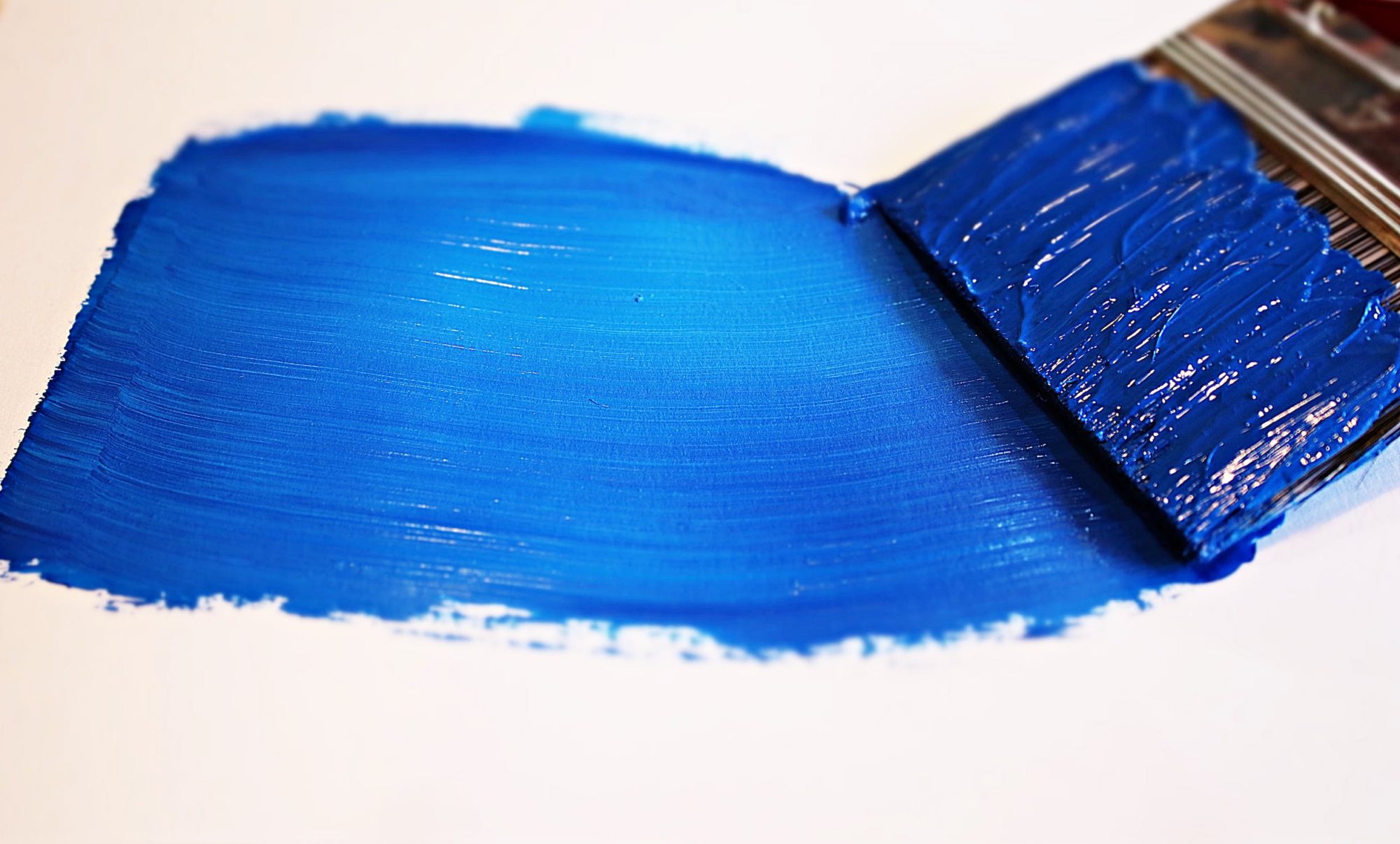
Here is an example of a red under-toned blue:

Here is an example of a green/yellow under-toned blue:

Redder under-toned blues are the more desired of the two, and many artists only use it for all blues, mixing in yellower hues if necessary. I prefer and find it easier at the stage I am at in my oil painting journey to use both for different purposes.
Knowing how to mix each blue for a desired color/result
It is important to distinguish the difference between the two. For example, mixing a green under-toned blue to make a red under-toned color will decrease the vibrancy and sometimes muddy the desired color.
Similarly, if you are looking for a more muted green, using ultramarine with the redder under-tone will deliver more desired results, with red being on the opposite end of the color wheel from green. The same constitutes for a muted purple/mauve: purple is at the opposing end to yellow.
FAQ
What is Ultramarine Blue Primarily Used For?
Ultramarine blue is used as a primary blue! This applies for skies, oceans, shadows, etc.
There are both French Ultramarine and classic, french being redder and classic being greener. I think it is important to have both and experiment in your mixing skills to see what colors can derive from certain inputs.
What is are greener blues primarily used for?
They are mostly used for the sky, and I like to use it for tropical oceans that have a greener tint to them. Cerulean blue can be found most notable with artist Claude Monet’s La Gare St-Lazare. I use yellower/greener blues for any vibrant greens that I am mixing.
What is a good starter set for oil paints?
Winsor and Newton offers a great selection of oil paints to start with, including water soluble options. This set includes both a warm (red) French ultramarine and a cool (green/yellow) toned cerulean!
Comments are closed.