
Spring is often associated with light and pastel colors because they represent the renewal and growth of the season. Lighter colors, such as soft pinks, blues, and pale yellows, symbolize the new beginnings that come with spring. A light spring color palette will encompass the hopeful feeling spring brings.
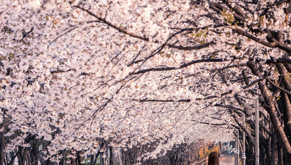
These colors are often seen in nature during the season, such as in cherry blossom trees and tulip fields.
Light colors are also popular in spring fashion, as well as interior design. They can brighten up a room or outfit, and create a sense of optimism and positivity.
Overall, a light color palette is a popular choice for spring because it reflects the spirit of the season and brings a sense of brightness and renewal.
A light spring color palette can not only be applied to your artwork for the feng shui of your living environment and artwork. It can also be applied to your wardrobe, but there are differences in how each should operate.
Start with your focus color
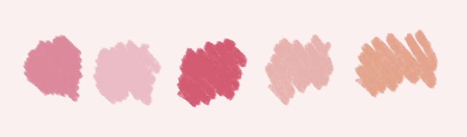
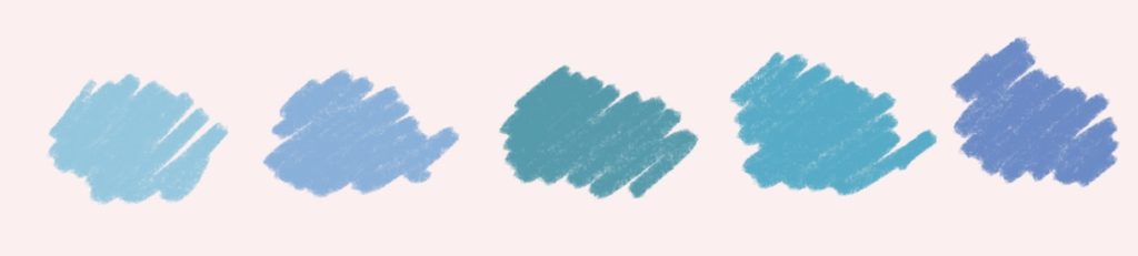
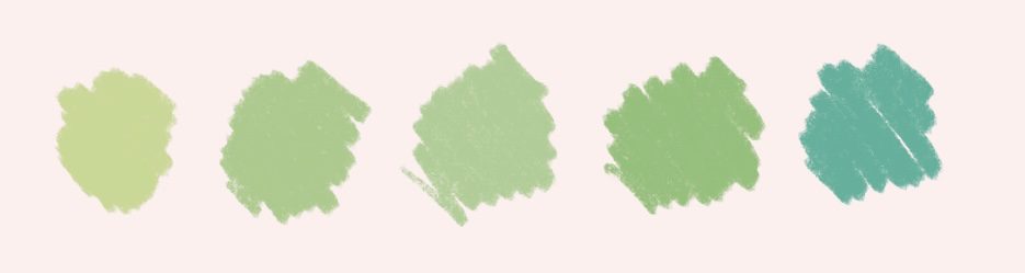
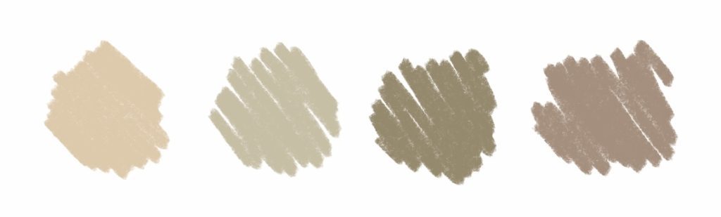
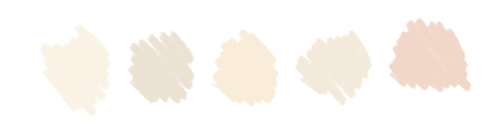
When creating a light spring palette, you need a focus color. Do you want a brighter look, softer look, duller look? Some popular options for a light spring focus color include:
Soft Pink
This gentle color is associated with romance, and is a classic choice for a spring color palette. It can be paired with shades of green or blue to create a delicate and soothing color scheme.
Sky Blue
Light blue is a calming and serene color that evokes feelings of tranquility and peace. It pairs well with pastel pinks and yellows. It can also be paired with bright greens or corals for a more playful and energetic palette. Light blue resembles the sky, and because of this, it can be mixed with just about any palette.
Pale Yellow
Yellow is associated with happiness and sunshine, making it a great choice for a spring color palette. A soft, pale yellow creates a warm and inviting atmosphere, and pairs well with shades of blue or green.

Mint Green
Mint green is a fresh and modern color that can add a pop of color to a light spring palette. It pairs amazingly with pinks and purples for a playful and feminine palette. Also, with blues and grays for a more sophisticated and serene color scheme.
Light Purple
Light purple, also known as lavender, lilac, or pastel purple, is a soft and delicate color that can create a fresh and calming atmosphere. It’s a popular color for spring because it reflects the season’s blooming flowers and bright skies.

Ultimately, the choice of base color for a light spring color palette is a personal one, and should be based on your preferences and the mood you want to create. It’s always a good idea to experiment with different combinations and shades to find the perfect balance for your project.
Add some neutrals
Adding neutral shades to a light spring color palette can help balance out the pastels and add depth and dimension to the color scheme. Here are some neutral shades to consider:
Beige
A soft beige can add warmth and create a natural feel in a light spring palette. It can be darkened or lightened easily.
Grey
A light gray can add sophistication and elegance to a light spring palette. It pairs well with pastel blues and greens.
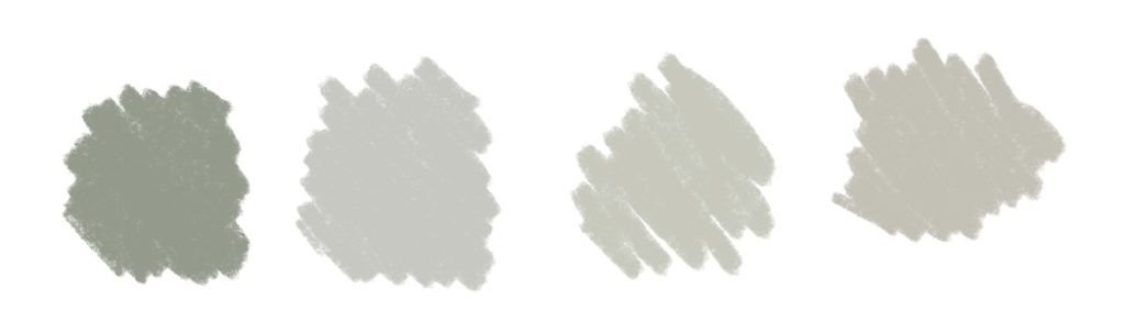
Cream
Cream is a versatile neutral that can be used to soften and balance out brighter colors in a light spring palette. Since it is lighter, it will bring down the lightness in the other colors.
White
White is a classic neutral that can be used as a background or accent color in a light spring palette. It pairs well with all pastel shades and can help brighten up a color scheme. However, if you want a bright color to pop, stay away from white and opt for something duller.
When adding neutral shades to a light spring palette, consider using them as a base color or as a background color to allow the pastels to stand out. You can also experiment with different shades and tones of neutrals to find the perfect balance for your project. Remember, the goal is to create a harmonious and balanced color scheme that evokes the spirit of spring.
Experiment!
Whether you are painting, illustrating, or building an outfit, its best to experiment. Something that could really compliment someone else’s house or skin tone could not look right on you, and vice versa. However, art is subjective, and I tend to make decisions based on feeling.
This just means that I use experimentation differently. I play around with the colors until I feel it looks best. This usually does not have much to do with what compliments each other, but maybe instead what contrasts!
Consider the mood and atmosphere you want to create, as well as the purpose of your project. You can also try using different shades and tones of each color to create depth and dimension in your palette. Remember, the key to a successful light spring color palette is to create a harmonious and balanced color scheme that reflects the spirit of the season.
FAQ
How can I get quick palettes for spring?
Procreate has a great feature where you can insert any image and they will give you a full color palette. I have a post on it here.
Comments are closed.