

With summer coming to an end, autumn is approaching. With Halloween, Thanksgiving, Harvests, and gatherings in general to prepare for winter, creating balance and harmony with decor is very important. A good deep autumn color palette should have balance, vibrancy, and lots of good bases.
In this post, I am going to give you a formula for an autumn color palette that will never fail you. No matter what color you’d like to put together, the balance will always make sense!
Step 1: Define Your Purpose for the Palette
Make sure that you determine a purpose for your color palette. Are you focusing on a theme?
For example, if your theme is a Halloween fall. You will obviously associate more dark colors for fall as opposed to softer ones. Then, focus on what type of emotion you want to convey.
Do you want a bold statement? An eery one? Once you have established that, you will know what direction to go in.
Step 2: Gather Inspiration
This is a crucial step in creating a color palette. You will want to look at other artworks to see how they highlight certain colors. It’s important to understand how a color wheel works and how to mix colors together.
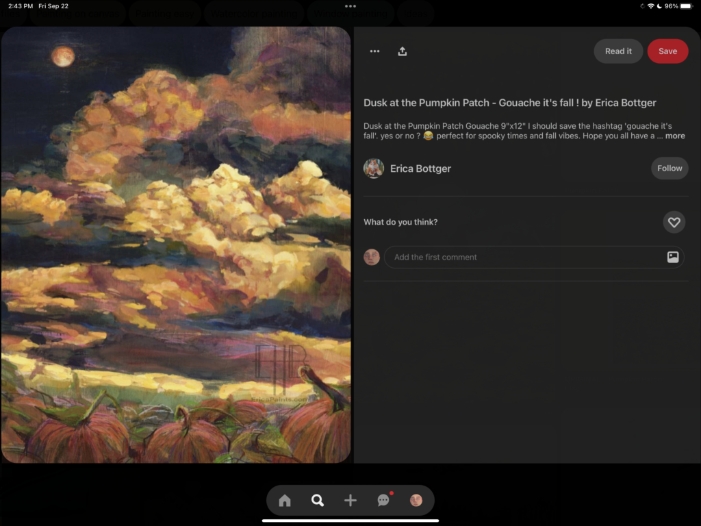
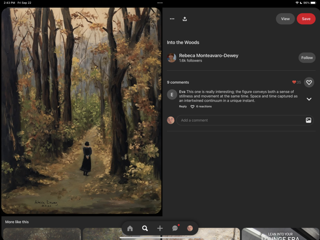
What I like to do is use Pinterest. Go on Pinterest and type in what you are looking for. For example, if you are looking for pumpkin patch-related deep autumn color palettes. Heres a cheat sheet for that (make sure to look up at least three different key phrases):
Paintings of bright pumpkin patches in autumn
Spooky pumpkin patches at night
Bright orange focused paintings
Step 3: Start with A Base Color
There are two main reasons why it is important to start with base colors to create a deep autumn color palette:
- Establishes a Visual Anchor: A base color provides a visual anchor for your palette. It’s a central color that sets the tone and theme for your design or project. This helps create a cohesive and unified look.
- Ensures Color Harmony: By beginning with a base color, you can build the rest of your palette around it using color harmonies like complementary, analogous, or triadic schemes. This ensures that the colors work harmoniously together, creating an aesthetically pleasing result.
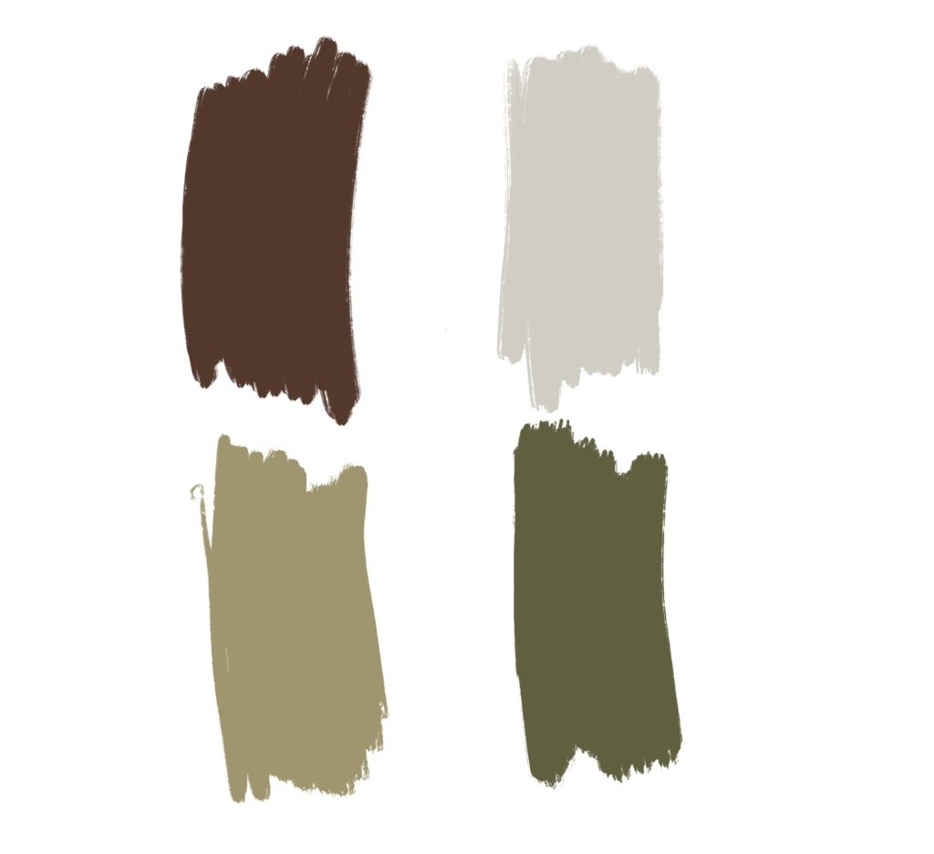
With Autumn colors, most of the time the colors are quite natural. It usually consists of: browns, oranges, reds, greens, purples, and other earthy tones. For your base colors, I would recommend choosing a more muted version of whatever color you are thinking. I like to use procreate for all of my color mixing as it is straightforward and similar to live painting. For example, a muted brown would be a better base than a vibrant one:
The reason why is because you are going to choose a focal point color after this. If your base color is too vibrant and busy, it will distract from where you are wanting to draw attention to. Save the vibrancy for the next step. Your base color acts as the color that all other colors will pair well with, and it can serve as a background or themed color.
Be sure to choose one-three base colors!
Step 4: Pick Contrasting Tones
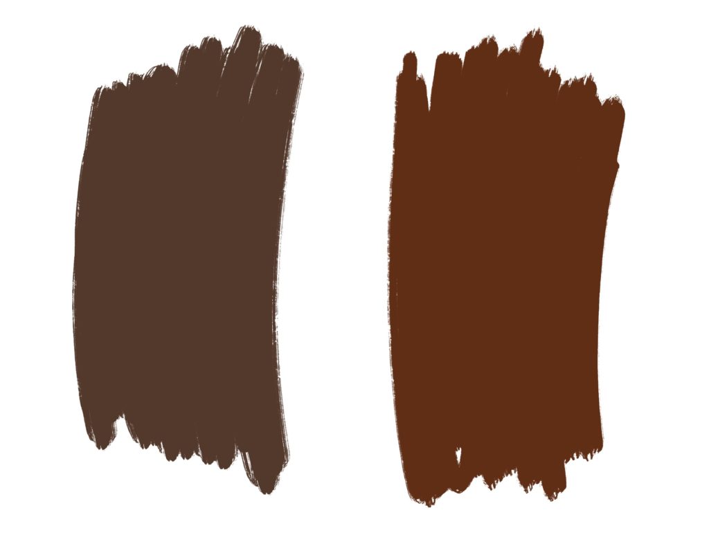
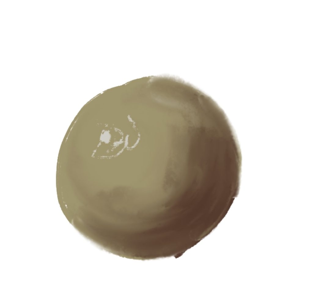
Now that you have your base color/colors, it’s time to pick colors that will compliment these well. An essential part of picking your contrasting colors is to choose different colors. Dont use a contrasting color of the same exact hue, just darker. Heres an example of the difference (note how much more dynamic and enticing to look at the ball with the brown contrasting shades instead of just more green):
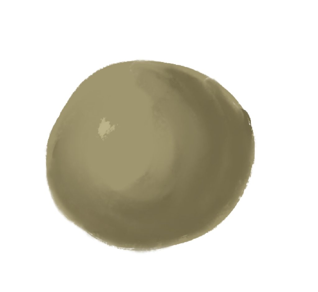
Is your base color light? Choose something darker! Is your base color dark? Choose something lighter! In this example, my two bases are on the left, and the contrasting tones that I chose are on the right:
Why is it important to have contrast in a color palette?
- Depth and Dimension: Contrasting tones can be used to create the illusion of depth and dimension in 2D designs. For example, using dark and light shades in an illustration or graphic can give objects a three-dimensional appearance. It makes it easier to see the values.
- Highlighting Information: Contrasting colors can help highlight important focal points in your artwork or decor. This makes it easier for viewers to identify key takeaways from the information presented.
- Emphasis on Colors and Hues: If you use contrasting colors, it can make the colors really pop. Instead of just seeing
Step 5: Pick Your Focal Points
Now, it is time to focus on your “money pieces.” What are the colors that you want to be the center of attention? Here’s an example of what I added on to the mock-up palette:
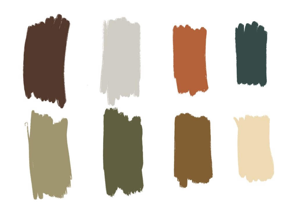
You can see that I chose, once again, two dark colors, and two light colors. However, this time, I chose vibrant colors. So, in the end, the palette was created with this formula:
Two base colors. Preferably muted, so they dont distract from the focal points.
Two colors to contrast the base tones. They dont have to be the same color, but make sure they are also relatively muted.
Four emphasizing colors. Make sure these colors are more vibrant! A good strategy is two lighter, and two darker.
You can double up or multiply these categories as well. If you need a massive palette, then do four base colors, four contrasting colors, and eight focal colors, etc.
Step 6: Test out the colors together
Make sure that if you are painting, you are either digitally combining the colors or making a small scale painting first. For example, I tried this out first:
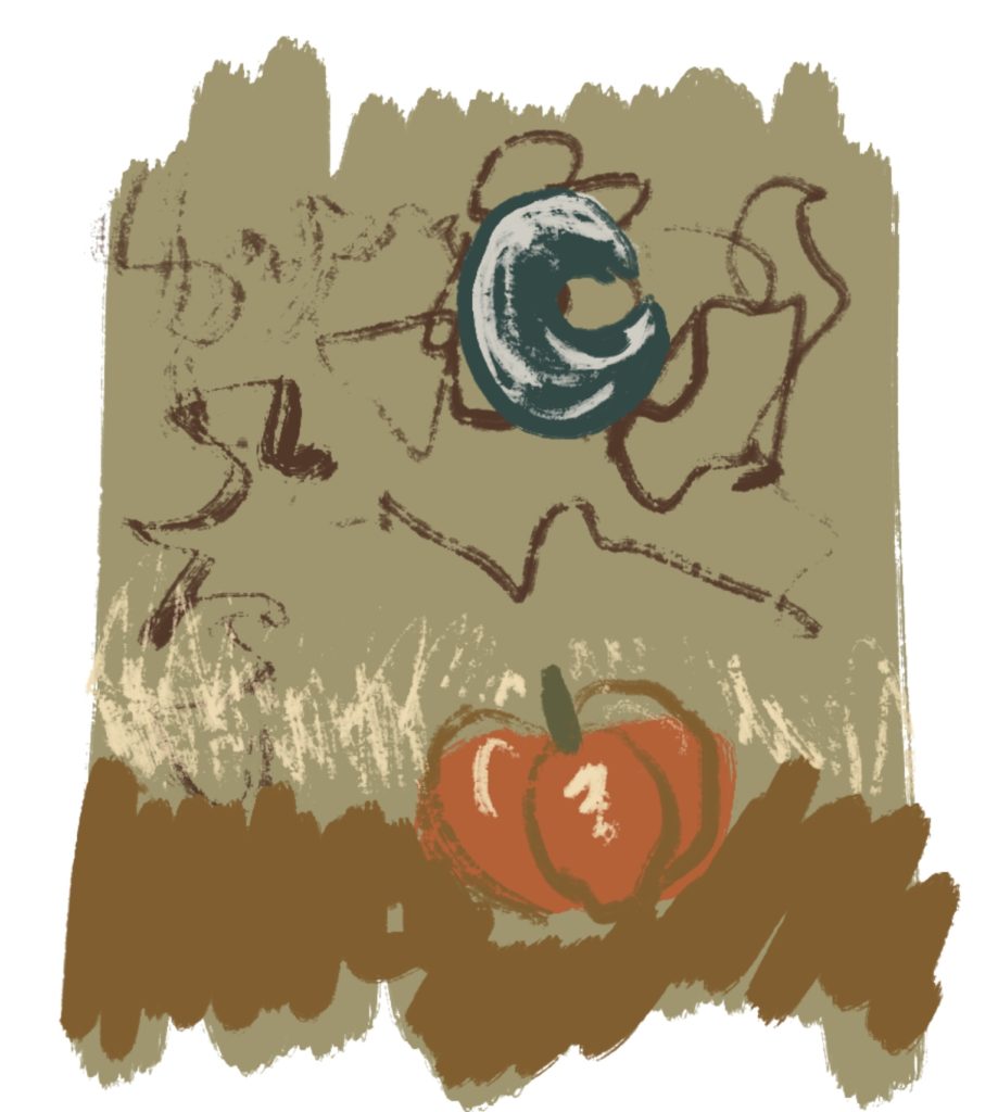
But, I realized that the vibrancy of the blue was overpowering the attention on the pumpkin, but since I did a rough draft first, I was able to make a quick change:
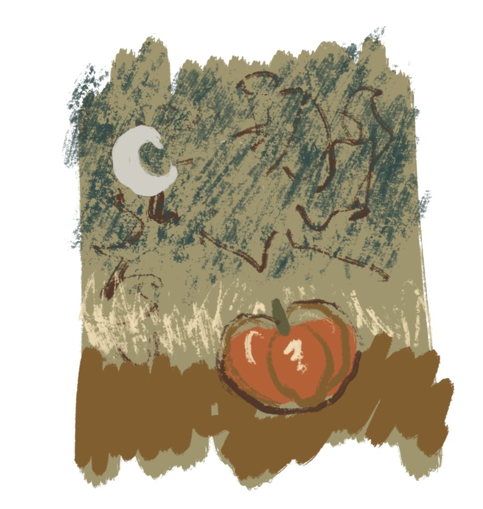
I was able to re-incorporate the blue so that it is still a center of attention, but it isnt taking away from the main subject. This is why it’s always important to do a small (sometimes crappy) version of your drawing first! You never know what will look weird or different when you actually see it compared to envisioning it.