
Color theory was a struggle for me to learn when I began painting because of how much information there is! It is the study of how colors interact with each other, and how they can be combined. This post will explain the color wheel for beginners and offer insight to how it can be applied.
Color is just one of the seven elements of art. If you are a painter, color theory is important for all aspects of mimicking colors. A color wheel for beginners can be quite hard to grasp, but the information below will make it much easier!
For this article, I used all of my images from my procreate app. I also have a post on taking advantage of your procreate palette abilities.
The Color Wheel
The color wheel is a tool that shows how colors are related to each other. It is the first step in understanding color theory for a painter. It consists of 12 colors arranged in a circle.
The color wheel is used by all artists to have a visual representation of how colors affect each other.
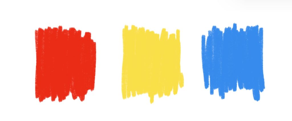
Primary Colors
With color theory for beginners, primary colors are where you should start learning. The primary colors on the color wheel are the first tier in understanding color theory. These colors cannot be created by mixing other colors together.
They are simply red, yellow, and blue.
Secondary Colors
Secondary colors are created by mixing two primary colors together. They are green (blue + yellow), orange (red + yellow), and purple (red + blue).
Secondary colors are on a traditional color wheel as well.

Tertiary Colors
Tertiary colors are the third combination of colors that are next to each other. A good example is a red violet or greenish yellow. If you mix a primary color with an equal amount of a secondary color, you get a tertiary color.
They also make “analogous” colors on the color wheel. These are colors that are right next to each other or adjacent. This can help to create cohesive color palettes.
Ex: green, green-yellow, and yellow are analogous to each other.

Hue, Saturation, and Value
The main pigment that is in a color is called hues. This applies to all colors on the color wheel, hues refer to the main tone on display. For example, a banana has a yellow hue.
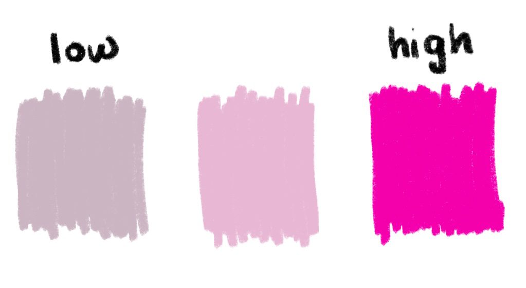
Next, saturation refers to the intensity or purity of a color, ranging from a bright, vivid color to a dull, muted one. With a muted pink compared to hot pink, the “muted” has low saturation.
Value is the lightness or darkness of a color, from white to black. A good way to look at this is a navy blue compared to a light blue. Most often, a “shade is added when the darkness is increased. In this same way, a “tint” is added when the lightness or whiteness is increased.
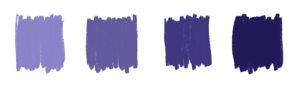
The difference between saturation and value is that saturation goes from pigment to greyscale. Value has more black or white in the color.
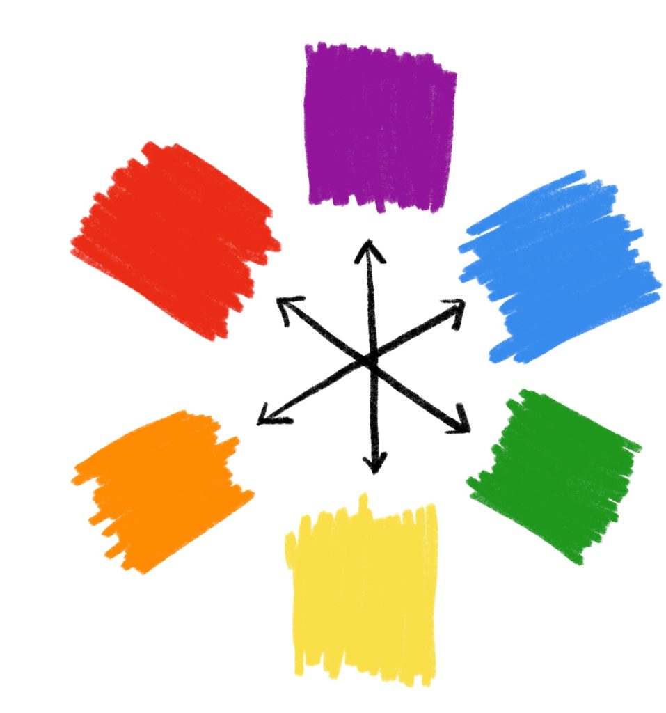
Complementary Colors
Complementary colors are opposite to each other on the color wheel. When mixed together, they mute each other out completely. For example: red and green, yellow and purple, blue and orange.
This is because they are a primary color, and the secondary color on the color wheel that is not made from that primary.
Therefore when placed next to each other, complementary colors create a high-contrast, vibrant effect. When painting, complementary colors are a great way to add more depth or value to a muted tone than just applying black or white.
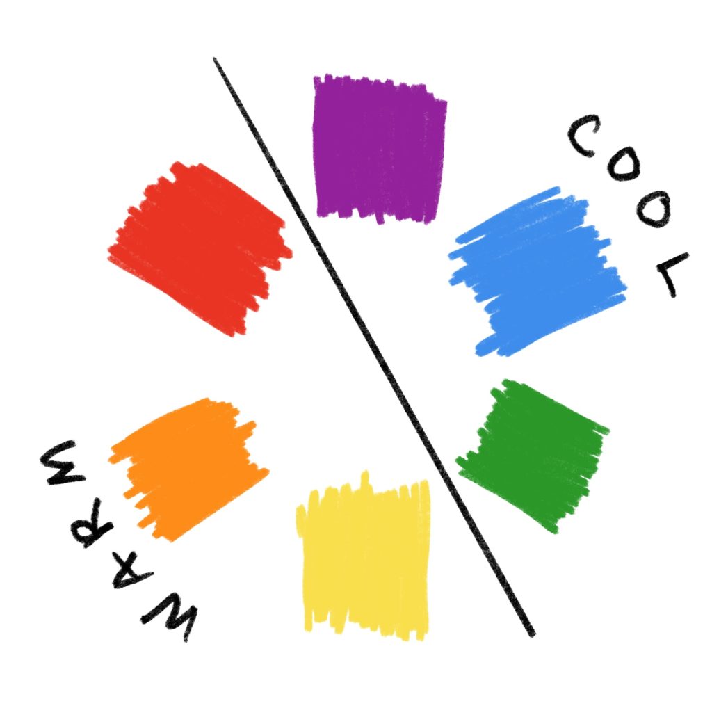
Warm and Cool Tones
Now that you know the basics of what colors mean to each other, you can begin to look further into their makeup and see more differences.
The interesting part of this is that there are three primaries, and only warm and cool categories. Yellow and red both fall into the warm toned side of the color wheel. Blue falls under the cool toned side.
Warm colors tend to be associated with energy and excitement, while cool colors tend to be associated with calmness and relaxation. This falls into the realm of color psychology.
How can I use this information to make cohesive palettes and art?
A color wheel for beginners might display the similarities and differences in colors, but not how to use them. Understanding the color wheel allows you to see what colors play into each other. This is good for many reasons:
1.) Knowing what colors to mix
You then know when mixing colors, what will give you what result. Now, you know that mixing complementary colors will give a muddy result, just like mixing primaries will give another vibrant result.
2.) Understanding what hues your eyes can follow
Whether your color scheme is for a painting or a vision board, you know what primaries make up certain colors. This means that you can learn to stick to the same hues to create harmony. However, it can also mean that you are mixing or adding two complementaries to create balance.
3.) You can convey messages easier
While orange and blue on the same canvas can be quite contradictory, it is in the eyes of the artist to convey that meaning. Being able to display cohesion with colors of the same likeness, or colors of opposing hues, add so much to the artistic experience.
Comments are closed.